Art on Display. Formas de expor 1949-69
Event Slider
Date
- Fri,
- Closed on Tuesday
Free admission for student card holders on fridays from 18:00 to 21:00.
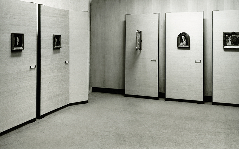
This exhibition takes the museography of the Calouste Gulbenkian Museum as its starting point, marking its 50th anniversary.
The Italian designer Franco Albini advised the Calouste Gulbenkian Foundation on the most contemporary examples of good museum design. The museum, which opened in 1969, was strongly influenced by his background in contemporary Italian design, notably that of Carlo Scarpa.
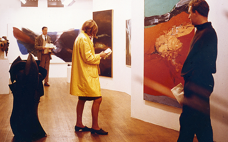
The exhibition recreates some of the period’s classic solutions to the display of art, contrasting the stasis and fixity of 1950s’ design with some of the more playful and immersive designs, by Aldo van Eyck and the Smithsons, which had already emerged by the time the Museum opened.
This exhibition allows the viewer to experience these different ways of looking at and being with art. It is accompanied by archival photographs and drawings, revealing display solutions conceived for the Museum.
The exhibition is an associate project of the Lisbon Architecture Triennale 2019. In 2020, it will also be held at the Het Nieuwe Instituut, Rotterdam.
Curators: Penelope Curtis (Calouste Gulbenkian Museum) and Dirk van den Heuvel (Jaap Bakema Study Centre/Het Nieuwe Instituut)
In association with: Het Nieuwe Instituut, Rotterdam
VIDEOS
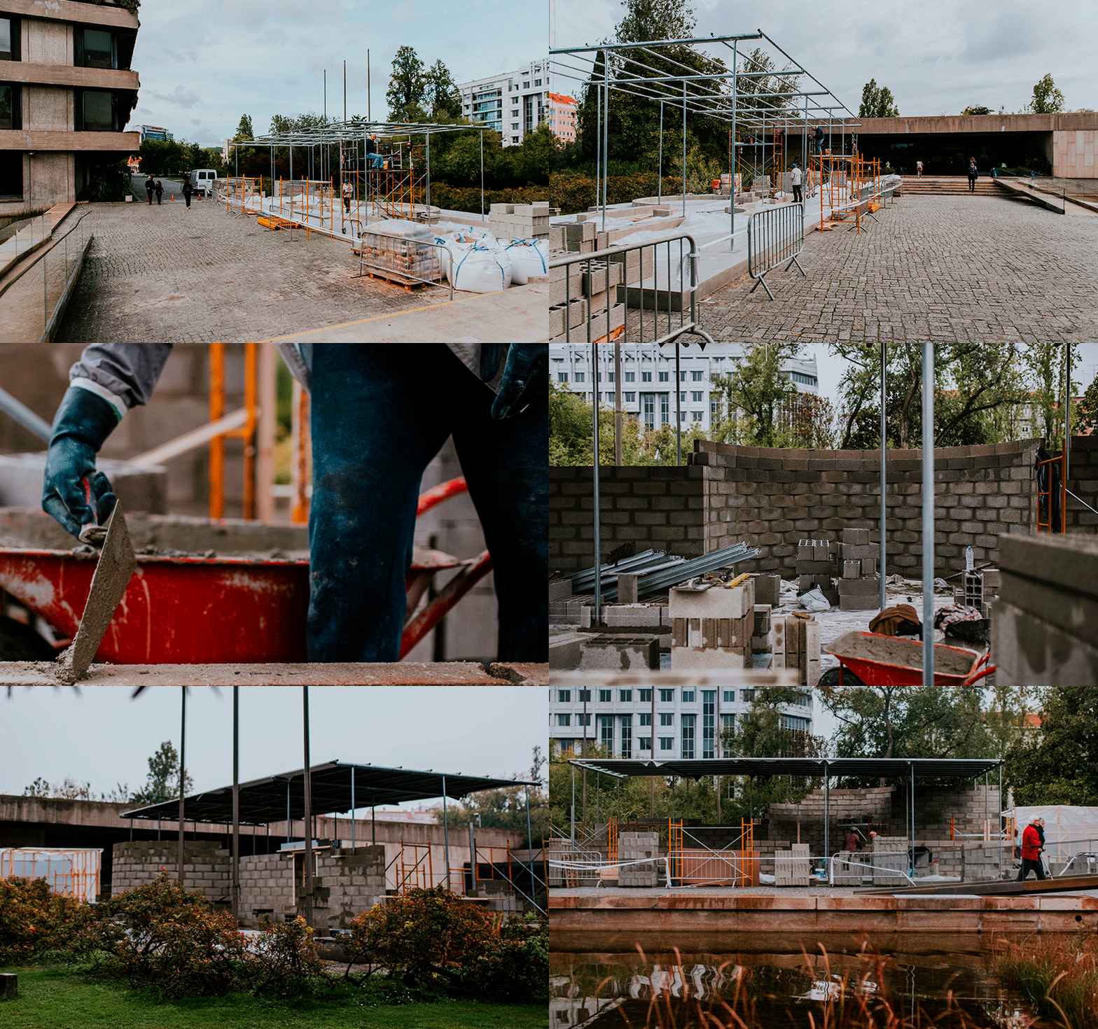
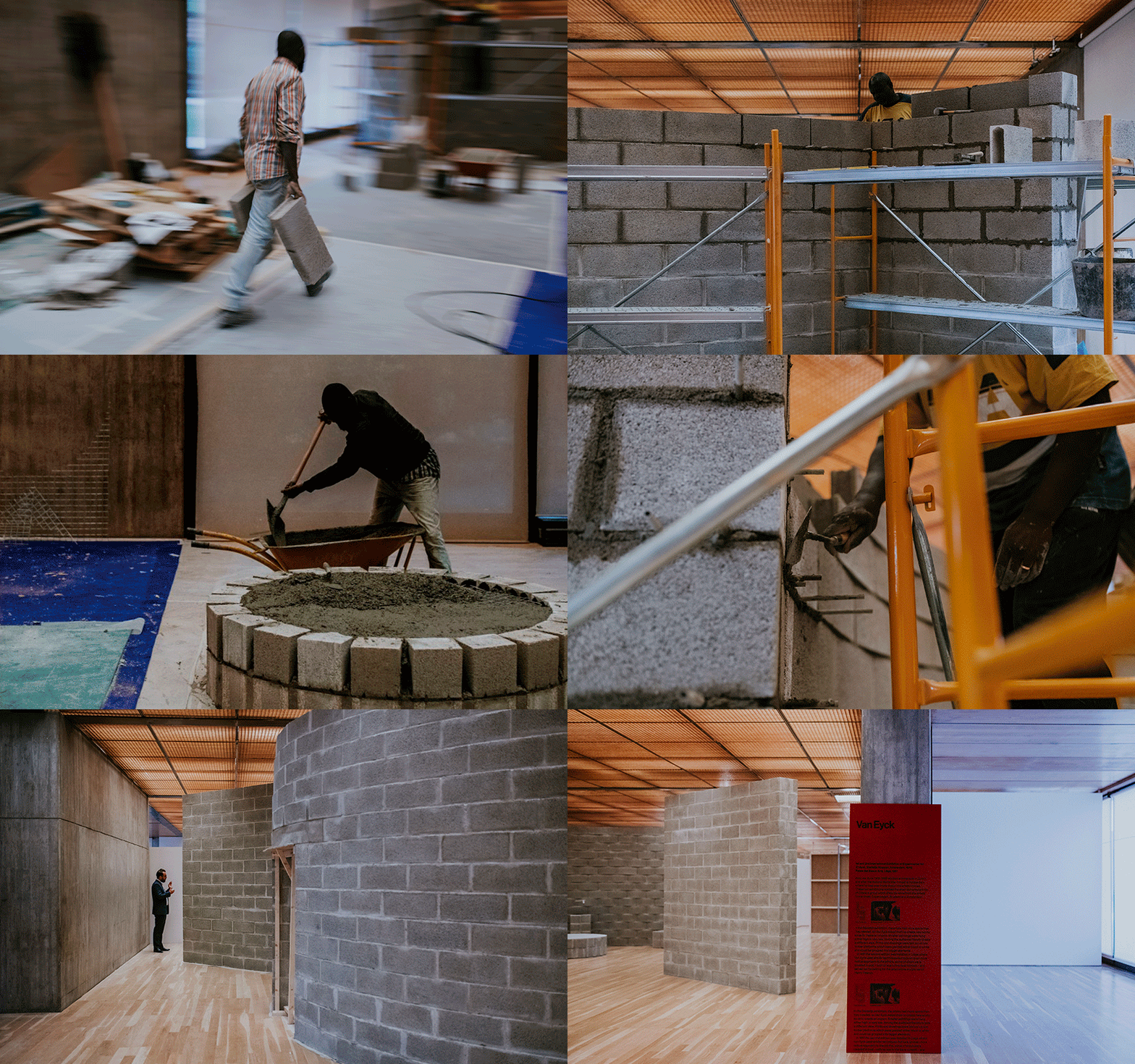
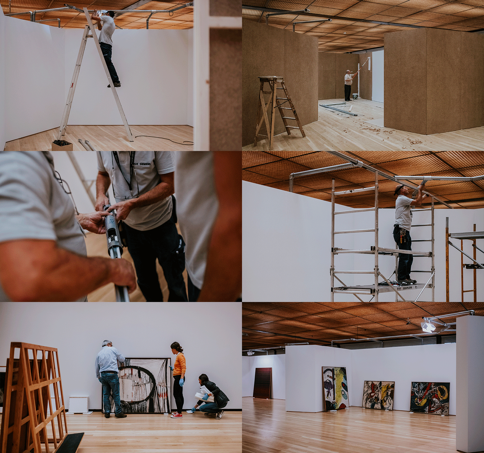
UNDER COSNTRUCTION
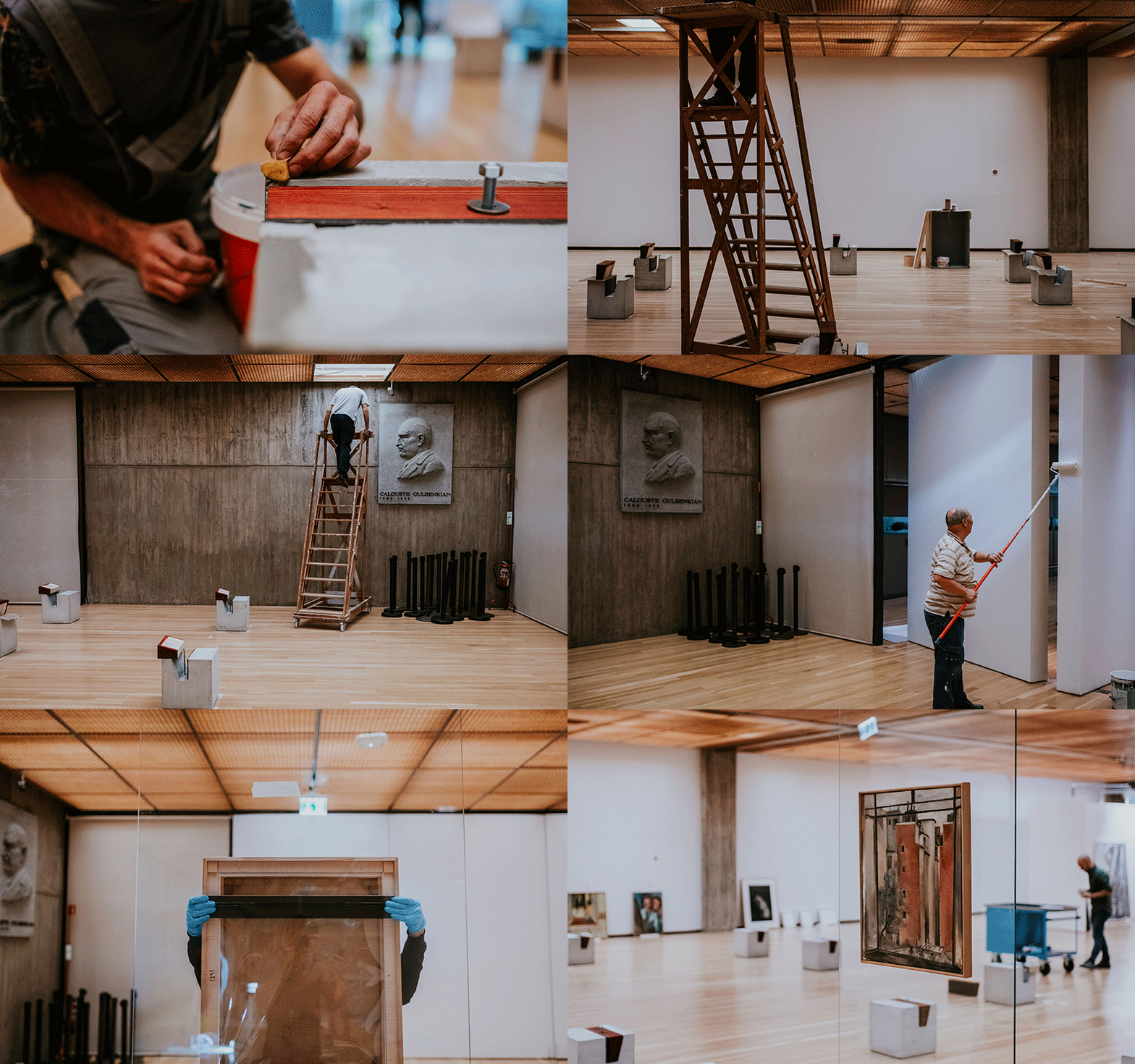
Would you like to take a closer look at the construction of this exhibition?
We invite you to take an unprecedented look behind the scenes at the assembly of this innovative project that presents different ways of showing and experiencing art.

Topics

Albini and Helg

Scarpa

Van Eyck I

Van Eyck II

Smithsons

Bo Bardi

Museum
-
Albini and Helg
Palazzi Bianco and Rosso, Genoa, 1951–62
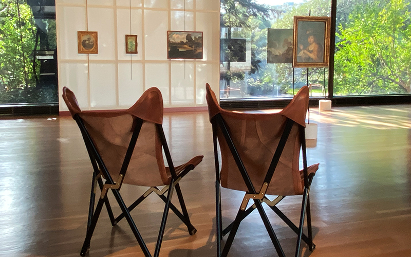
aod-g-23 View of the exhibition with the recreation of the projects by Franco Albini and Franca Helg 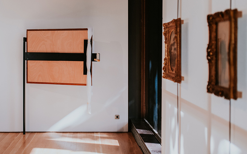
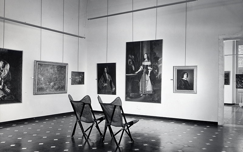
aod-g-15 View of the exhibition with the recreation of the projects by Franco Albini and Franca Helg. Photography: © Pedro Pina Franca Helg (1920–1989) and Franco Albini (1905–1977) began working together in 1950, founding the Studio Albini-Helg in 1952 in Milan. The first commission signed by both was a thorough restoration of an old building re-opened as a museum: the Palazzo Bianco. This was swiftly followed by work on its sister museum, the Palazzo Rosso. The projects were immediately noticed and well received, and this reminds us that their work, which might now seem relatively modest, had very inventive aspects.
In the exhibition Art on Display, the reproduction of the components from these two museums – poles planted on bases, lever arm and Tripolina chairs – might be seen to represent the two sides of Albini and Helg’s thinking: the contemplative and the engaged. In both there is a wish to make the paintings more object-like, bringing them into the real world. Wherever appropriate they removed frames which had been fitted posthumously, and allowed the paintings to float more freely, sometimes encouraging viewer interaction as well. The distinctive Tripolina chairs, which we invite the visitors to use, were grouped throughout the Palazzo Rosso, and encourage quiet enjoyment.
In Art on Display, we also hint at the way Albini and Helg designed a temporary exhibition of Italian art in São Paulo (1954), reconstructing a luminous backdrop against which the paintings are balanced.
-
-
Scarpa
Correr Museum, Venice, 1957–60
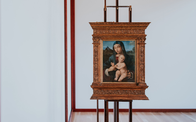
aod-g-6 View of the exhibition with the recreation of the project by Carlo Scarpa. Photography: © Pedro Pina 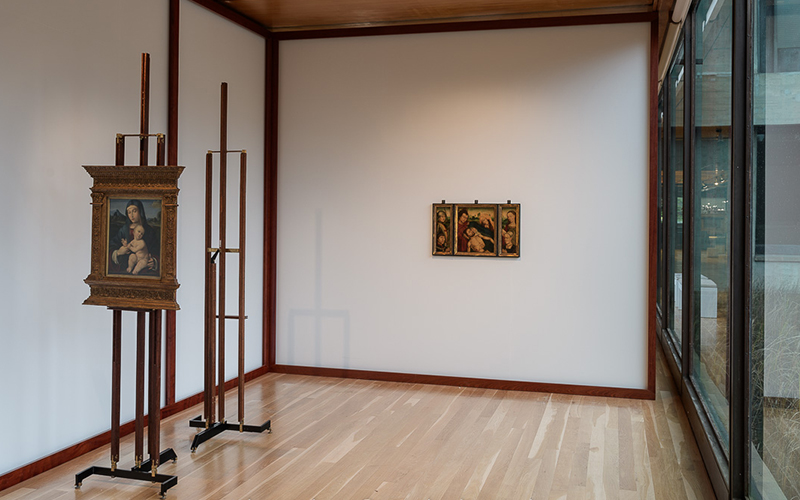
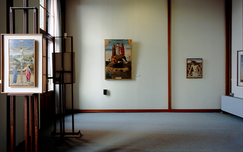
aod-g-5-roa View of the exhibition with the recreation of the project by Carlo Scarpa. Photography: © Pedro Pina Carlo Scarpa (1906–1978) began by designing commercial stands and tombs. He had already worked on partial remodelling within museums such as the Gallerie dell’Accademia in Venice (1949) when he was invited to take on the Palazzo Abatellis in Palermo, badly damaged during the Second World War. The Correr project was a little different, in that the building, later in date, was in much better condition. Although the opportunities for intervention were thus reduced, Scarpa nonetheless made subtle use of the site.
Scarpa dealt with the problem of historic walls by taking paintings away from the wall, finding solutions which relate both to the church and to commerce, singling out certain artworks for special treatment, as can be seen in the exhibition Art on Display.
The display solution which most characterises Scarpa’s museum projects is the easel.
The highly crafted detail and the usage of his easels makes them particular objects, and in the exhibition Art on Displaywe present two originals borrowed from the Museo Correr. Despite their high quality, the way the easels are pulled out from the wall and set at right angles to the window, evokes the artist’s studio. Scarpa’s construction of an image for a gallery is memorable.
-
-
Van Eyck I
Stedelijk Museum, Amsterdam, 1949
Palais des Beaux-Arts, Liège, 1951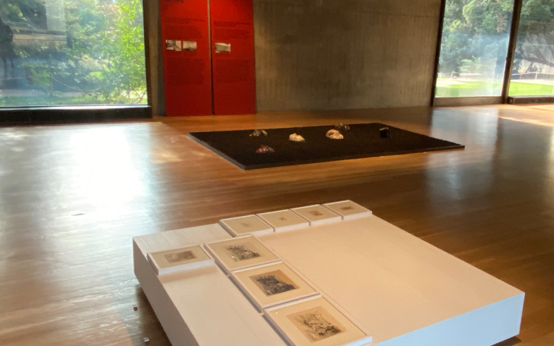
aod-g-45 View of the exhibition with the recreation of the projects by Aldo van Eyck. 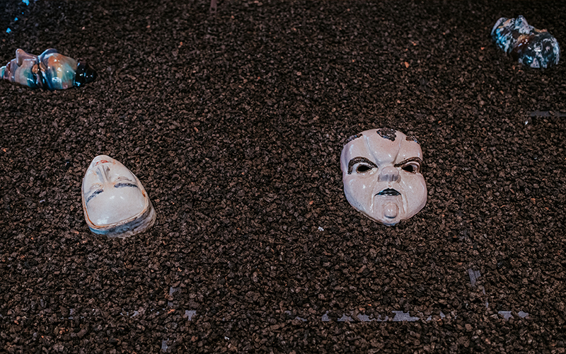
aod-g-4 View of the exhibition with the recreation of the project by Aldo van Eyck. Photography: © Pedro Pina Aldo van Eyck (1918–1999) studied architecture in Zurich. After the Second World War he moved to Amsterdam where he was drawn into the city’s artistic circles.
These two exhibitions marked the short but turbulent life of Cobra – a group which drew its name from the artists’ home cities: Copenhagen, Brussels and Amsterdam.
In the Stedelijk exhibition, the space was wider than needed, so Van Eyck asked the artists to conceive new works so as to create an impact. Smaller paintings were hung either high or very low, forcing the audience literally to take a different view. Prints and drawings were laid out on low timber platforms which were painted either black or white and could be grouped into bigger elements. In 1951 the second edition of the exhibition was installed in Liège where Van Eyck used similar techniques. However, he took an even more radical approach to the plinths. Some of them were covered in coal – with an eye to the local context of Belgian mines – and served as the setting for the small stone sculptures of Henry Heerup.
In the exhibition Art on Display, we recreate one of the low timber platforms used in the Cobra exhibition in Amsterdam and one of the Liège’s plinths, here covered in cork, an allusion to the importance of the material for the Portuguese economy.
-
-
Van Eyck II
Sonsbeek ’66, 5th International Sculpture Exhibition
Arnhem, 1966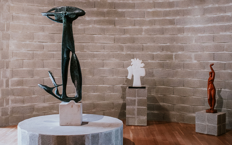
aod-g-2 View of the exhibition with the recreation of the project by Aldo van Eyck. Photography: © Pedro Pina 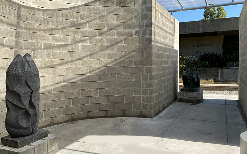
aod-g-22 View of the exhibition with the recreation of the project by Aldo van Eyck. In 1965–6 the architect Aldo van Eyck (1918–1999) designed and realised a temporary pavilion for the regular open air sculpture exhibition held in Park Sonsbeek and organised by the city of Arnhem in the Netherlands.
For the pavilion Van Eyck proposed an elementary structure of six parallel walls made of concrete blocks, which he manipulated into a surprisingly labyrinthine interior by inserting apses semi-circular and niches into the rectilinear structure. Van Eyck described the result as an urban space with its streets, alleys and small piazzas.
The sculptures were positioned on plinths made out of the same concrete blocks which created a sense of homogeneity. The scenography aimed to create an almost spontaneous encounter achieved by a relatively high density of artworks gathered together in the narrow spaces which forced the visitor to walk by the sculptures in close proximity.
In 2006, the pavilion was reconstructed with a more durable roof in the outdoor sculpture park of the Kröller-Müller Museum in Otterlo, just north of Arnhem. A fragment of this pavilion is reproduced in the main gallery, while outside, near the entrance to the Founder’s Collection, you can wander through a more complete part of this display structure.
-
-
Smithsons
Painting & Sculpture of a Decade 54–64
Tate Gallery, London, 1964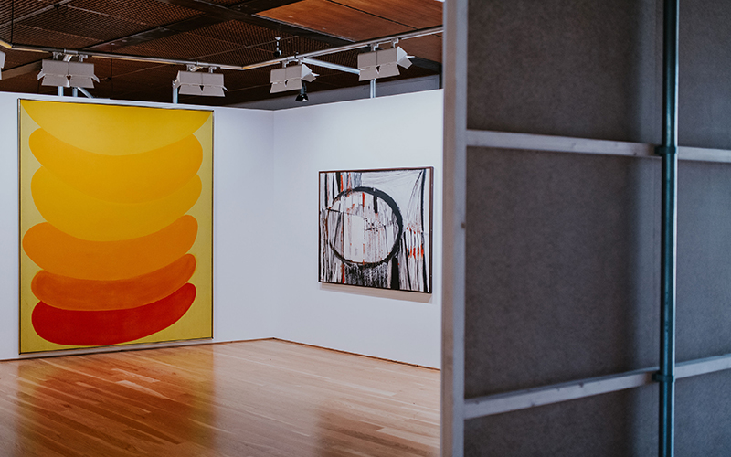
aod-g-7 View of the exhibition with the recreation of the project by Alison and Peter Smithson. Photography: © Pedro Pina 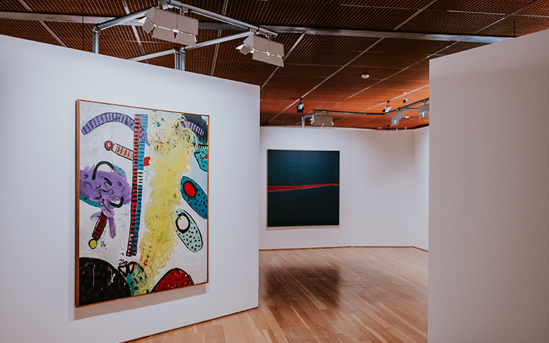
aod-g-9 View of the exhibition with the recreation of the project by Alison and Peter Smithson. Photography: © Pedro Pina The couple of architects Alison (1928–1993) and Peter Smithson (1924–2003) gained fame and notoriety as propagators of the New Brutalism architectural movement during the 1950s and 1960s.
In 1964, the exhibition Painting & Sculpture of a Decade 54–64 aimed to bring to London an extensive survey of the latest international art. It was organised by the Arts Council, funded by the Calouste Gulbenkian Foundation and shown at the Tate. Lawrence Gowing, an artist and writer, as well as a Tate Trustee, was the initiator and apparently suggested the Smithsons, who had already made some experimental exhibition designs for the Independent Group (independent group of young artists and architects).
Alison Smithson took the lead in designing what the couple called a ‘Milky Way’: a labyrinthine sequence of stark white spaces, one of which is reproduced in the exhibition Art on Display. The architecture of the neo-classical museum was completely and intentionally suppressed by a continuous screen that followed its own oblique geometry. Made of nine-foot high white boards, the space was illuminated by very bright, tungsten light. There was a frantic struggle to fit around 370 works in the available space, and decisions were often necessarily practical and radical. Nonetheless the ambition was to create an experience of intellectual association and sensory immersion.
-
-
Bo Bardi
MASP, São Paulo, 1968
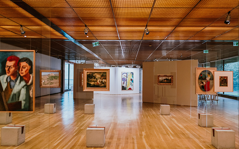
aod-g-29 View of the exhibition with the recreation of the project by Lina Bo Bardi. Photography: © Pedro Pina 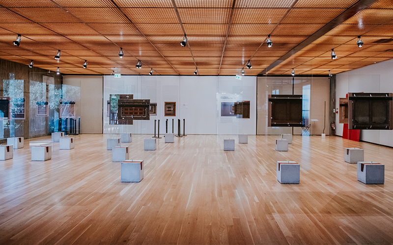
aod-g-30 View of the exhibition with the recreation of the project by Lina Bo Bardi. Photography: © Pedro Pina In 1946 Lina Bo (1914–1992) moved to Brazil with her husband, the art historian who was to become the first Director of the Art Museum of São Paulo (MASP). Pietro Maria Bardi commissioned his wife to design two presentations of the MASP collection before it was installed in a new building, which she also began to design in 1957.
The new building was inaugurated in 1968 but only opened in 1969. In this project the couple wanted something new and active, something which represented the monumental, in the best sense of the word, but also the popular, in the true sense of the word. Bo Bardi presented a massing of easels, in a regular grid, which despite their provisional impression, stayed in place for almost thirty years, until her husband’s death. Following this project, Bo Bardi began to see her role as releasing the artwork into a more democratic atmosphere.
This third installation, which we partially reproduce in the Main Gallery, is the one which has become famous.
-
-
Museum
Calouste Gulbenkian Museum
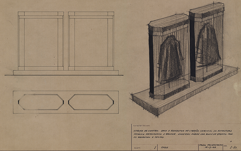
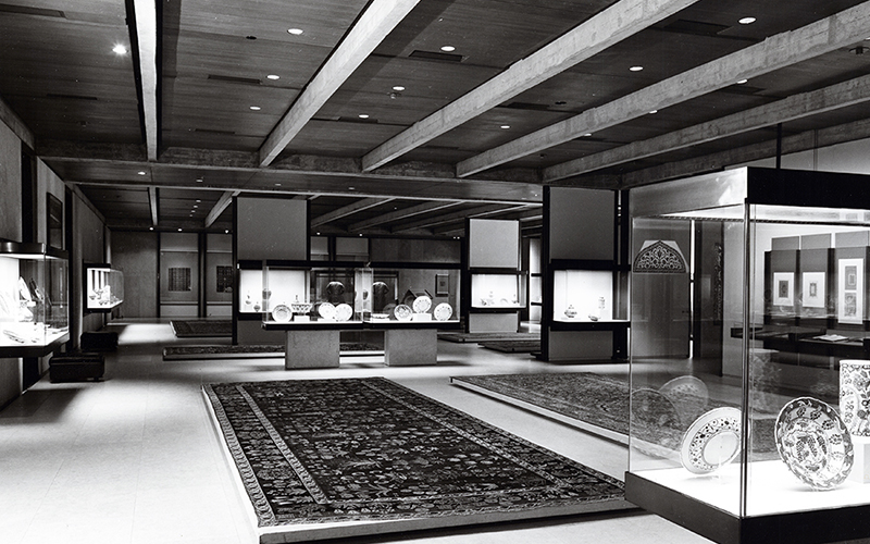
aod-g-41 Central case for the Islamic East section of the Calouste Gulbenkian Museum, [196?]. Gulbenkian Archives, GV A2-00336 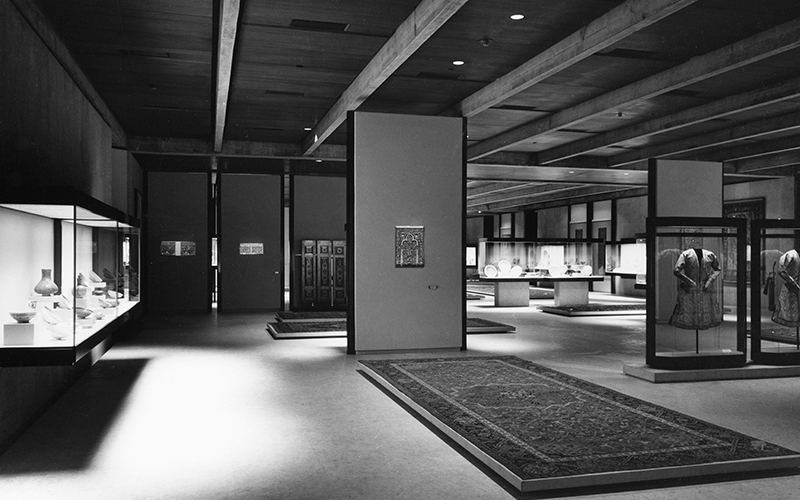
aod-g-40 Calouste Gulbenkian Museum. Islamic East gallery, 1970. Photography: Mário de Oliveira This autumn we celebrate the 50th anniversary of the Calouste Gulbenkian Museum. In the context of the exhibition Art on Display, we present in the hall and in the galleries of the Founder’s Collection a set of documents drawn from the Gulbenkian Archives and from the Museum archive, focusing more especially on the original appearance of the Museum.
The Museum programme was designed in 1958 by curator Maria José de Mendonça, who had been seconded from the Museu Nacional de Arte Antiga, and who was supported by an international panel of advisors in the field of architecture, design and museology: Leslie Martin, Franco Albini and Georges Henri Rivière. After the key groupings of the collections had been defined, three teams of architects were invited to take part in a competition which included the construction of the Museum and the Foundation’s Main Building. The results were closely managed by the Foundation, and the advisory team remained in place for over a decade, following the evolution of the project from beginning to end. Franco Albini, as a museum designer, had the most influence on the look of the Museum, which was ultimately designed by many people. Various components – including the silk, bronze and glass – were sourced abroad, and around half the cases were made in Germany. In the hall of the Founder’s Collection, we show some of the alternative designs originally presented for the museum that might have been, as well as documentation of the various stages of the Museum that we know today, from its conception to its construction.
Drawings from the project phase and a selection of photographs dating from 1970 – which shows the display solutions conceived for the Museum at the time of its opening – are presented throughout the different galleries in the Founder’s Collection.
-
Complementary Programs
Guided tours
Saturdays, 23 November; 14 December; 11, 18, 25 January; 15, 22, 29 February, 15:00
Ways of displaying, ways of seeing
Friday, 24 January 17:30
In Portuguese and in English
Booking guided tours
Guided tours in Portuguese, English or French
Booking
(+351) 217 823 800
[email protected]
More information
[email protected]
Making the exhibition
Satuday, 9 November, 15:00
Know more

