From the manuscript to the printed book
European books from the 15th and 16th centuries in the Gulbenkian Collection
Printing was born in the mid-15th century, in Mainz (present-day Germany), thanks to the experiments of men like Gutenberg, who introduced moveable metal type characters to the printing press, a device used in wine production. Through these two technologies, printing developed mostly on paper, being less costly than parchment, the material previously adopted in Europe for the copying and illustration by hand (illumination) of texts.
By allowing quicker and cheaper dissemination than what was possible with manuscript books, and responding to the emergence of an urban middle class as well as universities seeking more ways to convey knowledge, the printed book, often illustrated with woodcuts, became increasingly widespread in Europe during the 15th and 16th centuries, eventually replacing illuminated manuscripts. These two types of book, however, continued to coexist and influence one another, at a point of transition between the Middle Ages and the Renaissance.
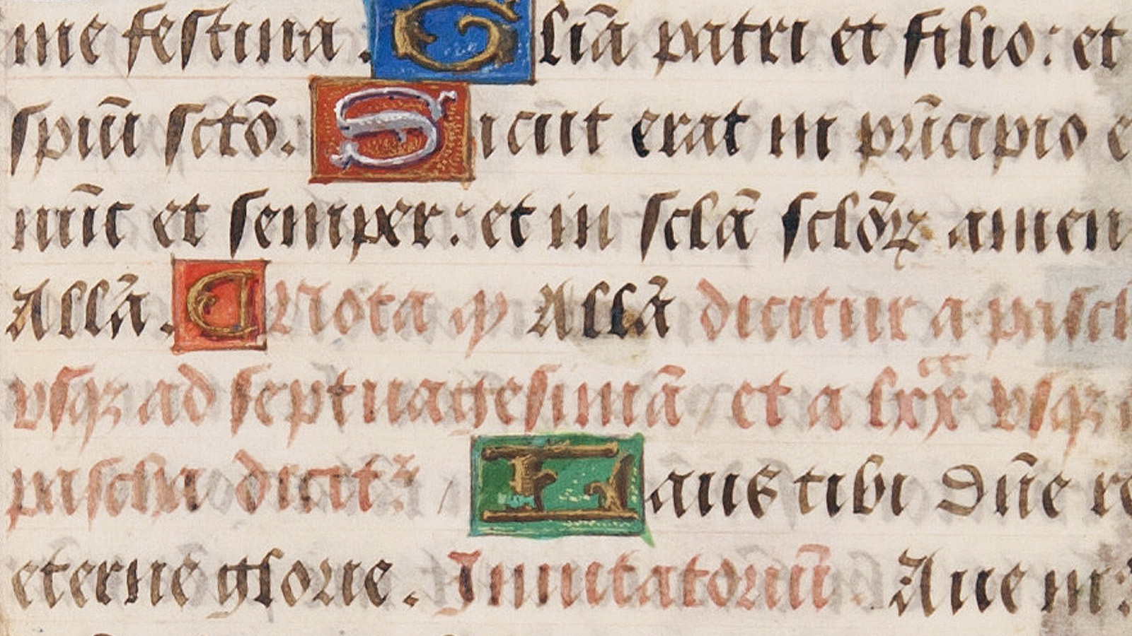
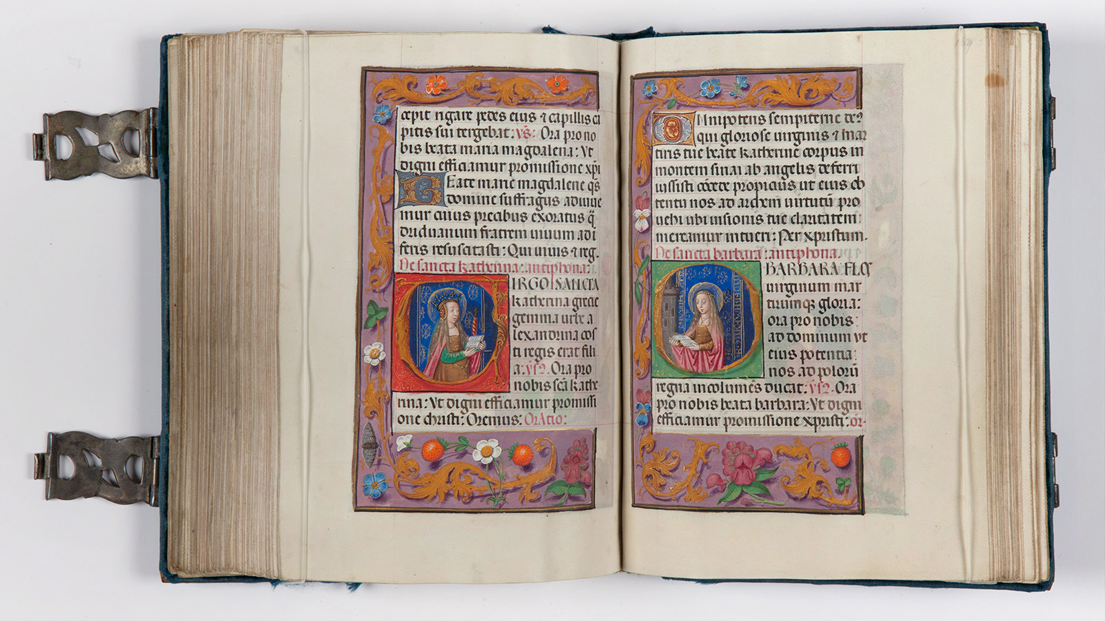
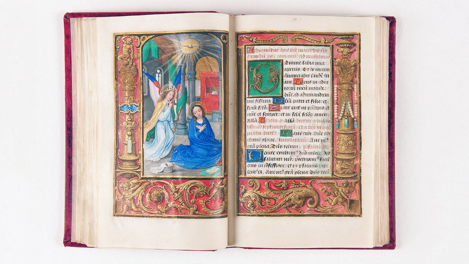
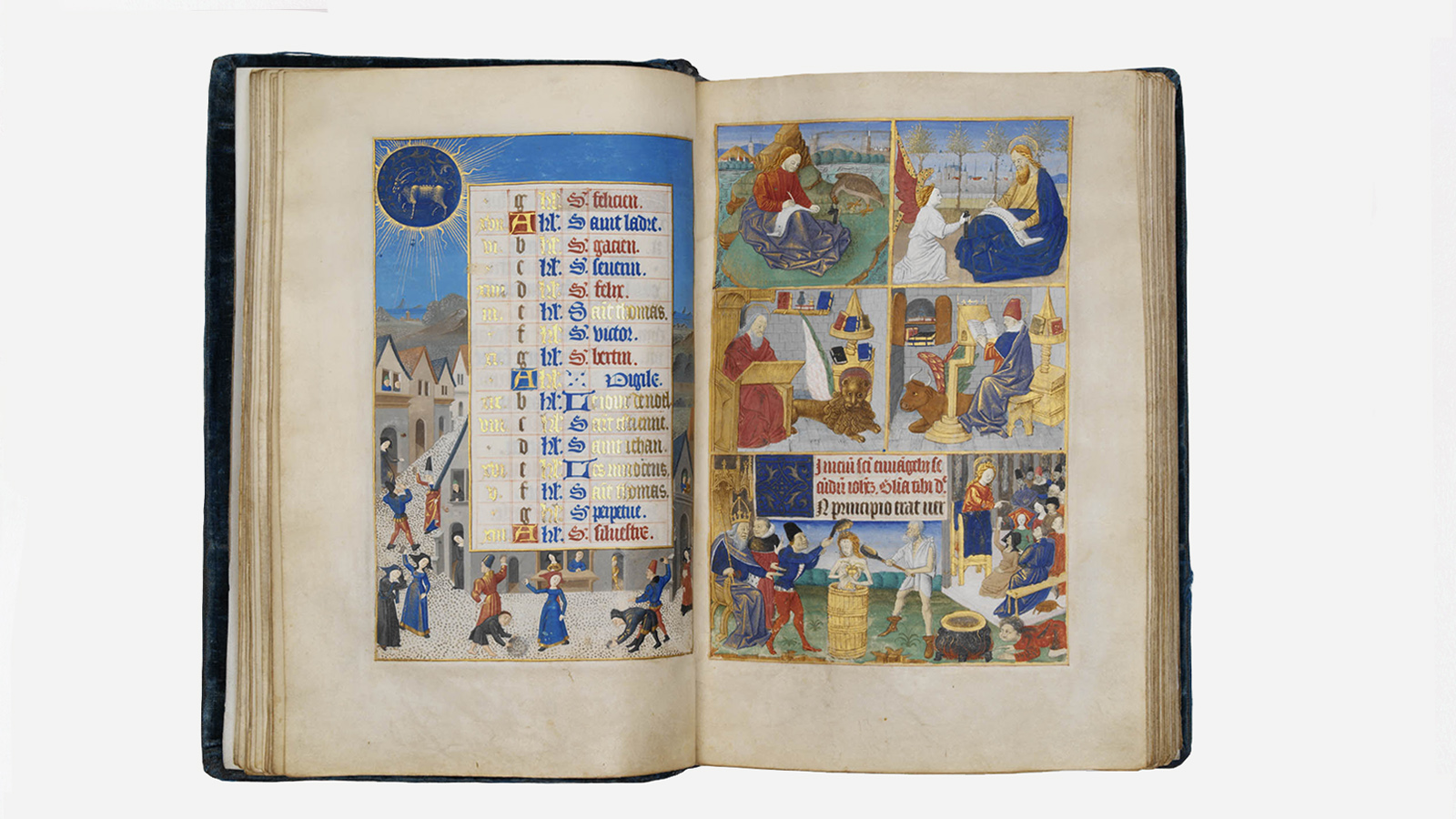
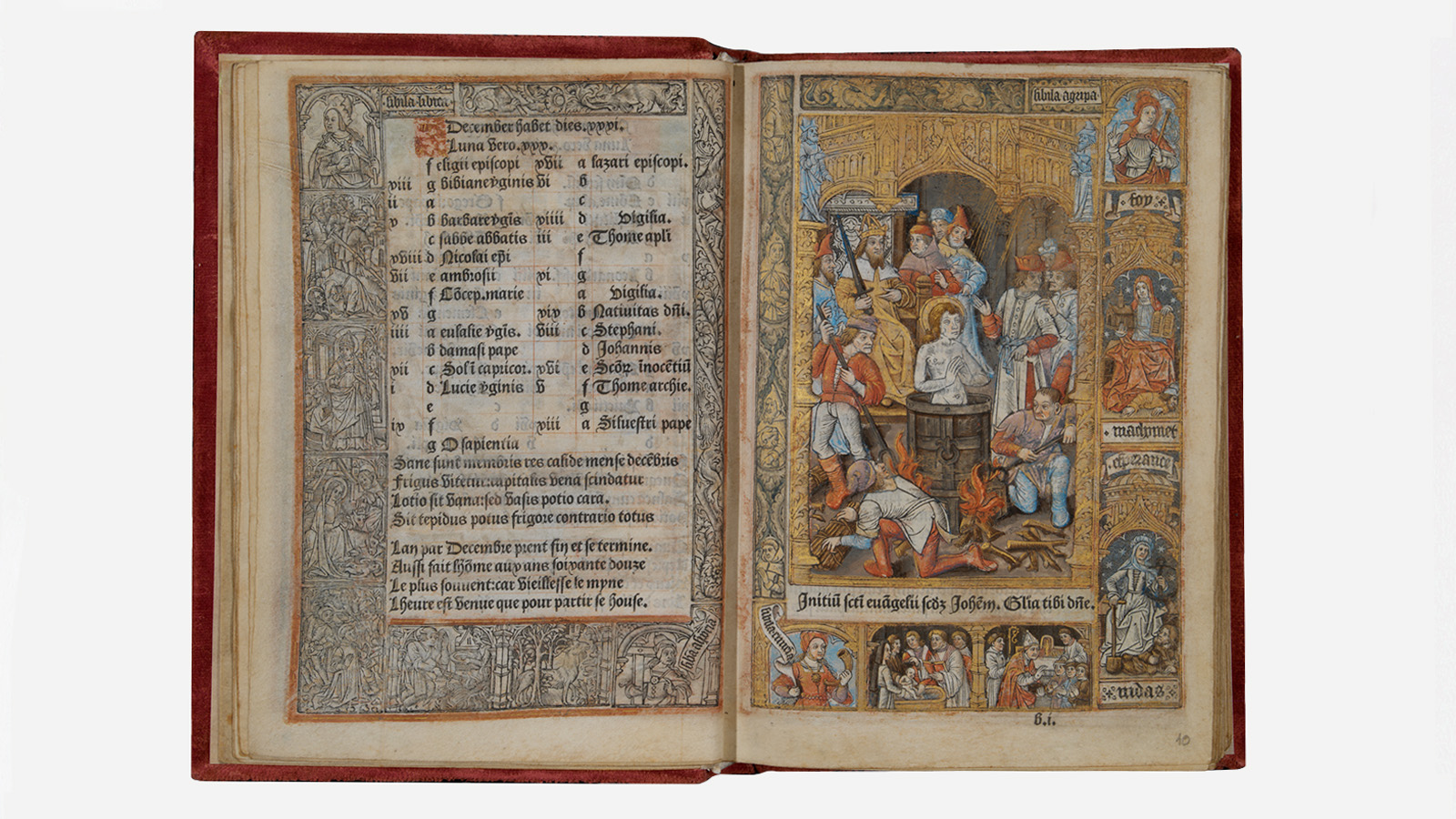
In some copies in the Gulbenkian Collection, we find illuminations from the early 16th century with cherubs and acanthus scrolls in forms that move from the Gothic towards the Renaissance (fig. 1 and 2). On the other hand, in comparison to the book of hours illuminated between 1460 and 1470 (fig. 3), we see that the only book in the collection printed before 1501, an incunable (fig. 4), imitates, in the writing and woodcuts, the formal codes of the manuscript book, with decoration in the margins and Gothic frames around the miniatures.
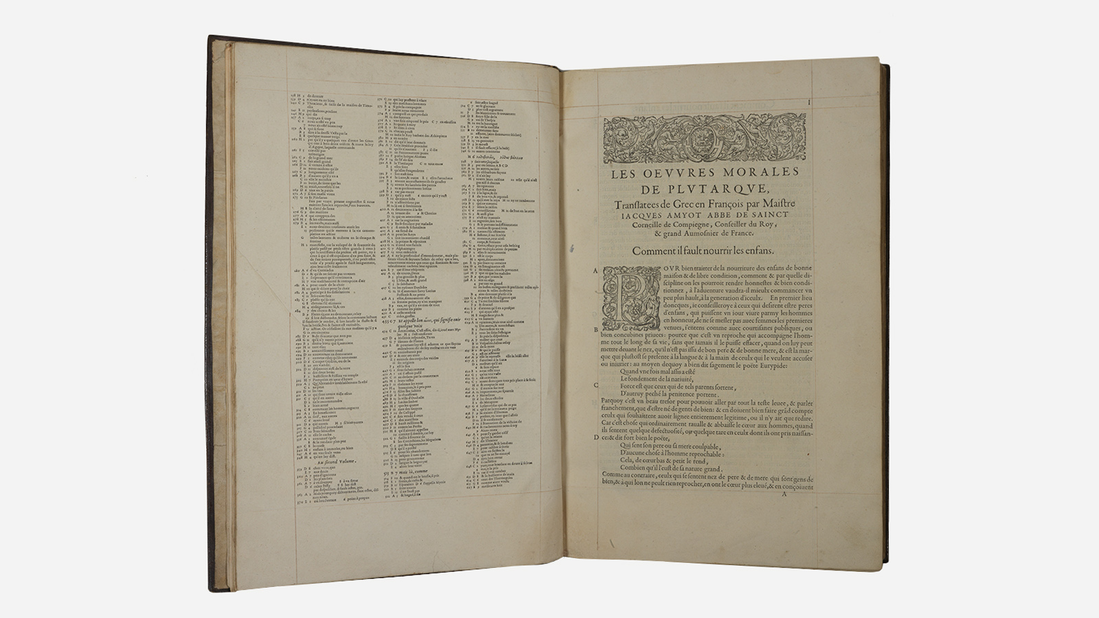
Printed books made from the 16th century on, increasingly protected and embellished with bindings in morocco leather and gold (fig. 5), started to reflect a humanist and renaissance society, with the publication of authors outside the sphere of Christianity and the Latin language, including some Greek thinkers from Antiquity. In the Gulbenkian Collection, for example, we find first editions of works by Flavius Josephus (fig. 6) and Plutarch (fig. 7), in Greek or translated to French.
![Aristotle, ‘Aristotelis Stagiritae Metaphysicorum, Libri quatuordecim cum scholiis ac varietatibus lectionum nuper additis’. Lugduni [Lyon]: Apud Theobaldum Paganum, 1556. Printed on paper; ‘fauve’ calfskin binding decorated in gold and painted with different colour wax. Calouste Gulbenkian Museum](https://gulbenkian.pt/museu/wp-content/uploads/sites/5/2023/09/fig-5-1.jpg)
![Flavius Josephus, ‘Flavii Josephi Opera’. Basileae [Basel]: Froben, 1544. Printed on paper; copy from the first edition of the complete work by Josephus in Greek. Calouste Gulbenkian Museum](https://gulbenkian.pt/museu/wp-content/uploads/sites/5/2023/09/fig-6-1.jpg)
In addition, although retaining some aspects of the medieval manuscript, such as initials with figurative or highly ornate decoration – nonetheless printed with Renaissance elements, such as children, sometimes winged, or plant scrolls – these books (fig. 8) started to assume their own graphic identity, both in the design of the lettering and the page layout. Thus, over the course of the century, elements autonomous from the formal schemes of medieval manuscripts started to appear, such as the inverted triangular tailpiece at the end of a piece of text (cul de lampe), the small prints separating sections of text (vignettes), often at the top of a page (headpiece), or even the full-page prints, without a strictly defined frame (fig. 9).
![‘Biblia Sacrosancta Testamenta Veteris et Novi’. Tiguri [Zurich]: Execudebat C. Froschoverus, 1543. Printed on paper. Calouste Gulbenkian Museum](https://gulbenkian.pt/museu/wp-content/uploads/sites/5/2023/09/fig-8b-1.jpg)
![‘Anthologia Gnomica. Illustres veterum graecae comoediae scriptorum sententiae, priùs ab Henrico Stephano, qui & singulas latinè convertit, editae’. Francofurti, ad Moenum [Frankfurt]: Apud Georgium Coryinum, impensis Sigismundi Feverabendii, 1579. Printed on paper with illustrations engraved on wood, including two engravings coloured and highlighted in gold and silver. Calouste Gulbenkian Museum](https://gulbenkian.pt/museu/wp-content/uploads/sites/5/2023/09/fig-8-1.jpg)
