
The letter is a form
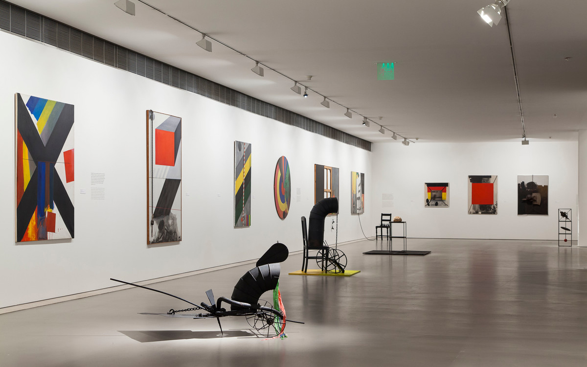
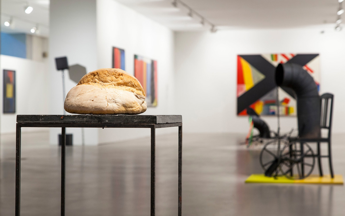
The exhibition X for Charrua, which I commissioned in 2015 with Ana Ruivo, was one of the most challenging retrospectives I ever had to organise. Barely known and little studied, the artist left a vast estate of paintings, drawings and sculpture which, at the time, was still mostly owned by his heirs.
As Ana Ruivo explained in her catalogue text from 1977, António Charrua (Évora, 1925–Lisboa, 2008) received ‘a new grant awarded by the Calouste Gulbenkian Foundation, which had a definitive impact on his ongoing examination of the relations between forms and symbols, the genesis and transformation of the conscience. (…) His forms are physical and symbolic, imbued with reality and reflection.’
In Charrua’s work, a letter is a form rather than a meaning. The ever-present ‘X’, sometimes large and dominant, sometimes discreet and fragile, could come from Tapiès or other Catalan artists he saw exhibited and who made an impression on him. And the ‘T’ from other paintings? The Hebrew ‘Tav’? A synthesis, then, of the most basic visual orthogonality?
During an interview, Charrua said the the ‘X’ is very structural, but also important to him, as a fan of strong colours, because no colour blends with others without some kind of form. Through form, he tried to balance a writing and a structure: ‘with the Ts, stairs, bars, circles, doors, the window, as a promise of something, labyrinths, with yet more things on the diagonal, marking flight.’ We begin to see that letters are structures for colour, but also permeated by something referential.
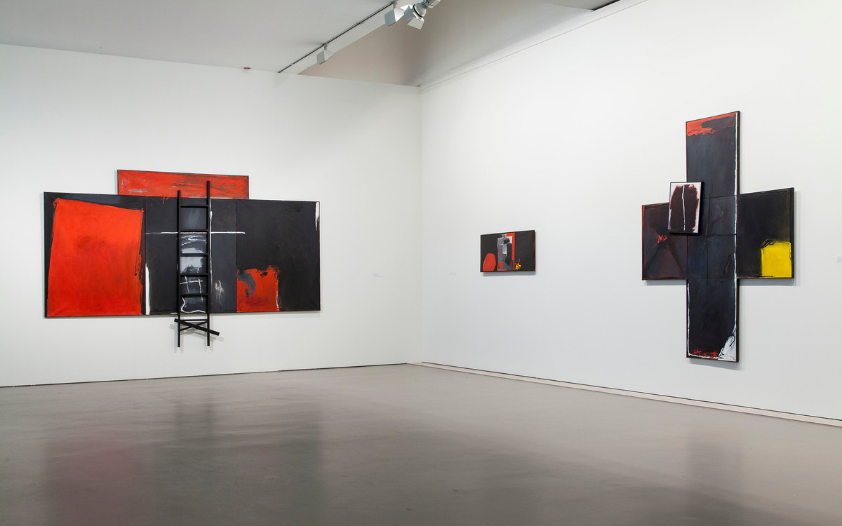
Ana Ruivo mentions the letter’s double meaning as confirmation (signing, marking or appropriating a place, a position) and as negation. As she reminds us, Charrua’s first ‘Grande X’ (Large X) appeared at the start of the 1960s. It had already been essayed in two paintings. ‘If we think of the X as a large structure for compositional organisation, there is an easy connection with the iron sculptures, and with the vertical boats/scarecrows of the 1950s paintings. The ‘Grande X’ emerges from the threats, from the advancing oblique forms that cross the canvas (…). The X becomes a material boundary and a metaphor. (…) The extremely defined way the form is presented in the 1970s would make way for a presence that is both disintegrated and overwhelming, in 1988, when various Xs multiply across large triptychs, all distinction between form and ground established through colour.’ Grande X II also appears as part of the crossover between murals and tapestry which the artist also created.
The formal alphabet with which Charrua worked, and which he called ‘the principal forms,’ was encapsulated in another exemplary piece: O Círculo, o X e a Cruz [The Circle, the X and the Cross] from 1992.
Leonor Nazaré
Curator of the CAM
Curators’ Choices
The curators of the CAM reflect on a selection of works, which include creations by national and international artists.
More choices